Data Analysis - Well Clustering
version - 0.75
The purpose of this notebook is to do well clustering and start to link the clusters geographilcally and to static data - it needs the field data - quicklook forecast (or final forecast) in order to analyse the full history of the well
It allows to do: - Do well clustering (any property) - visualizing and analysing cluster - Forecast cluster
libraries
[1]:
import numpy as np
import pandas as pd
import matplotlib.pyplot as plt
import os
import inspect
import frflib
from frflib.forecast_methods.forecast_wf import ForecastWF
from importlib import reload
from frflib.data_class import input_data
InputData = input_data.InputData
import time
from frflib.utils.var_computations import sum_dyn_df
from frflib.plots.plotly_ import plot_histogram,plot_time_serie, plot_stacked_series, plot_scatter, plot_regression, pie_plot
from frflib.plots.forecast_plots import plot_group_forecast
from frflib.utils.filter import filter_date, filt_cat

from frflib.plots.plotly_ import timeserie_heatmap
import seaborn as sns

from frflib.utils import pca_wf
import importlib
importlib.reload(pca_wf)

plt.style.use('ggplot')
[2]:
PATH_FRFLIB= os.path.dirname(inspect.getsourcefile(frflib))
PATH_TO_DATA= os.path.join(PATH_FRFLIB,"sample_data")
Data loading
Here are the main parameters to fill for this
[3]:
project_id="01"
wf_name="dataset_01_simple_wf"

WF_PATH=os.path.join(PATH_TO_DATA,f"{wf_name}.hdf")
DATA_PATH=os.path.join(PATH_TO_DATA,f"dataset_{project_id}.hdf")
[4]:
field_data = InputData.load_hdf(DATA_PATH)
df_st = field_data.df_static
wf = ForecastWF.load_from_hdf(WF_PATH, field_data)
field_data._compute_indicators()
wf.enrich_data()
Selection of area of interest
[5]:
field_data = field_data.subset(category='reservoir',filt_value= 'Fluvial' )
wl = field_data.filter_cat(category='reservoir',filt_value= 'Fluvial' )
[6]:
df_full = wf.get_result_summary(include_stat = True).loc[wl]
clustering
choose arguments in order to compute clustering
[7]:
df_enriched = wf.enriched_data.df_dynamic.loc[wl]
x_axis = 'cum_active_days'
k_comp = 3
min_x = 120
n_clusters = 4
computing on oil rate
[8]:
y_var = 'oil_rate_stbd'
df_oil, pca_oil, kmeans_oil, df_class_oil = pca_wf.pca_and_cluster(df_enriched, x_axis, y_var,min_x,k_comp, n_clusters)
principalComponents = pca_oil.fit_transform(df_oil)
[9]:
print(f"There are {df_oil.dropna().shape[0]} left in the dataset and {len(wl) - df_oil.dropna().shape[0]} removed based on min_x value")
There are 102 left in the dataset and 2 removed based on min_x value
computing on bsw
[10]:
y_var = 'bsw_vv'
df_bsw, pca_bsw, kmeans_bsw, df_class_bsw = pca_wf.pca_and_cluster(df_enriched, x_axis, y_var,min_x,k_comp, n_clusters)
[11]:
print(f"There are {df_bsw.dropna().shape[0]} left in the dataset and {len(wl) - df_bsw.dropna().shape[0]} removed based on min_x value")
There are 102 left in the dataset and 2 removed based on min_x value
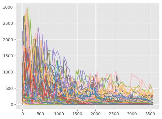
Step 1
Plot oil_rate_stbd for all the wells according to the active_days
[12]:
_ = plt.plot(df_oil.T)
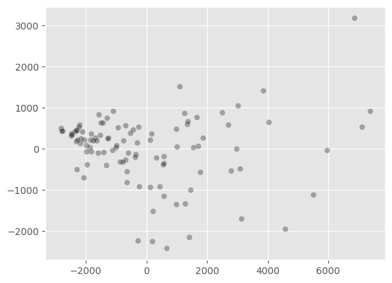
Step 2
After computing the PCA, we make a scatter plot of the 2 first components for all the wells.
[13]:
principalComponents = pca_oil.fit_transform(df_oil)
ax = sns.scatterplot(x = principalComponents[:,0], y= principalComponents[:,1],alpha=0.3, color='black')
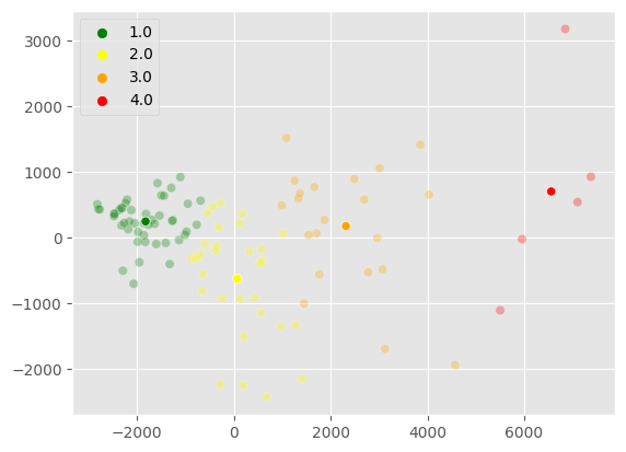
Step 3
Then we display the same scatter plot with the corresponding clusters. We also display the centroids of the clusters.
[14]:
i=0
j=1
colorslist = ["green", "yellow", "orange", "red"]
color_list = sns.color_palette(colorslist, n_colors=len(kmeans_oil.cluster_centers_[:,0]))


n_colors = len(kmeans_oil.cluster_centers_[:,i])
ax = sns.scatterplot(x = principalComponents[:,i], y= principalComponents[:,j],
                     hue=kmeans_oil.ordered_labels_, alpha=0.3, palette = color_list)

sns.scatterplot(x = kmeans_oil.cluster_centers_[:,i], y= kmeans_oil.cluster_centers_[:,j],
                hue=kmeans_oil.label_rank,ax=ax, legend = False, palette=color_list)
[14]:
<Axes: >
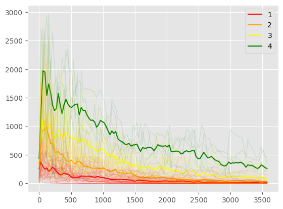
Step 4
We finally plot the centroid’s curve of each cluster, in addition to the well’s curve production.
[15]:
pca_wf.plot_wells(df_oil, kmeans_oil, pca_oil, inverted = False)
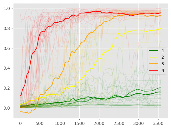
Plot other clusters bsw
[16]:
pca_wf.plot_wells(df_bsw, kmeans_bsw, pca_bsw, inverted=True)
Merge and Export
renaming the cluster based on cumulative production
[17]:
df_class_oil.columns = ['group_oil_num']
df_class_bsw.columns = ['group_bsw_num']

df_class_oil['group_oil']=df_class_oil['group_oil_num'].map({4:'excellent',3: 'good', 2:'average',1: 'bad'})
df_class_bsw['group_bsw']=df_class_bsw['group_bsw_num'].map({1:'excellent',2: 'good', 3:'average',4: 'bad'})
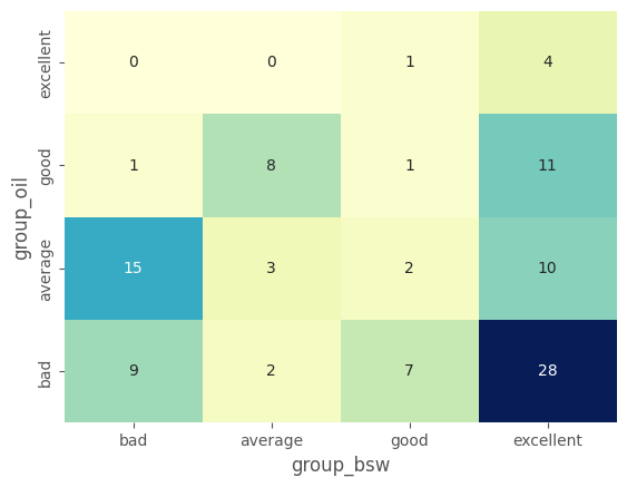
Confusion Matrix
[18]:
confusion_matrix = pd.crosstab(df_class_oil['group_oil'], df_class_bsw['group_bsw'], rownames=['group_oil'], colnames=['group_bsw'])
confusion_matrix = confusion_matrix.loc[['bad','average','good','excellent'],['bad','average','good','excellent']]
[19]:
import seaborn as sns
sns.heatmap(confusion_matrix.iloc[::-1,:], annot=True, cmap="YlGnBu", cbar=False)
[19]:
<Axes: xlabel='group_bsw', ylabel='group_oil'>